The conversation went something like this.
“It's under Solutions.”
“Right.”
“Then Integrated Solutions.”
“Of course.”
“Then Specialist Support.”
“And then?”
“Then the service.”
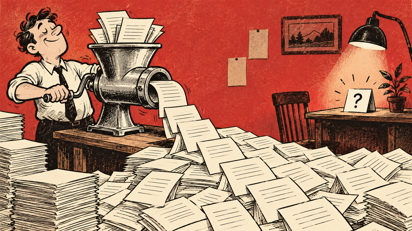
I had asked where the website explained a straightforward maintenance visit. We had accidentally recreated the plot of a quest game.
Once I arrived, the page was decent. It named the service, explained the arrangement and had a sensible way to request it. There was nothing especially wrong with the destination. Getting there had been the whole bloody problem.
Nobody had intended to hide it. That was the interesting bit.
The menu reflected the way the organisation discussed its own departments. Each label meant something in meetings. Together they created a journey where visitors had to learn the internal vocabulary before finding the thing they wanted to buy.
We often call this a usability issue, which is true but slightly polite. It is also a failure to admit that our favourite labels may mean sod all outside the office.
I tried the route again on a phone. The menu folded. The submenus folded. The small arrows suggested several different things depending on where I tapped. I was now doing archaeological work with my thumb.
A colleague knew the page address by heart and found it immediately. They were not being difficult when they said it was easy to find. They were just carrying a map the customer didn't have.
That is why I dislike navigation reviews where everyone knows the answer before the task begins.
Give someone a situation instead. The maintenance unit has started making a noise; they want to know whether you visit the site and what they need to send first. Let them try to find the relevant explanation. Listen to the names they expect. Watch the point where they choose a category and then quietly reconsider it.
You don't need to turn five colleagues into a statistically grand research programme. You do need to avoid mistaking familiarity for clarity.
In this imaginary menu adventure, the useful change was boring. The service got a clearer label. Related pages linked to it where the need came up. The page appeared in a place somebody with that situation might reasonably look.
We didn't flatten the whole website into a giant list. Some offers do need grouping. We just stopped demanding that a first-time visitor understand the company diagram.
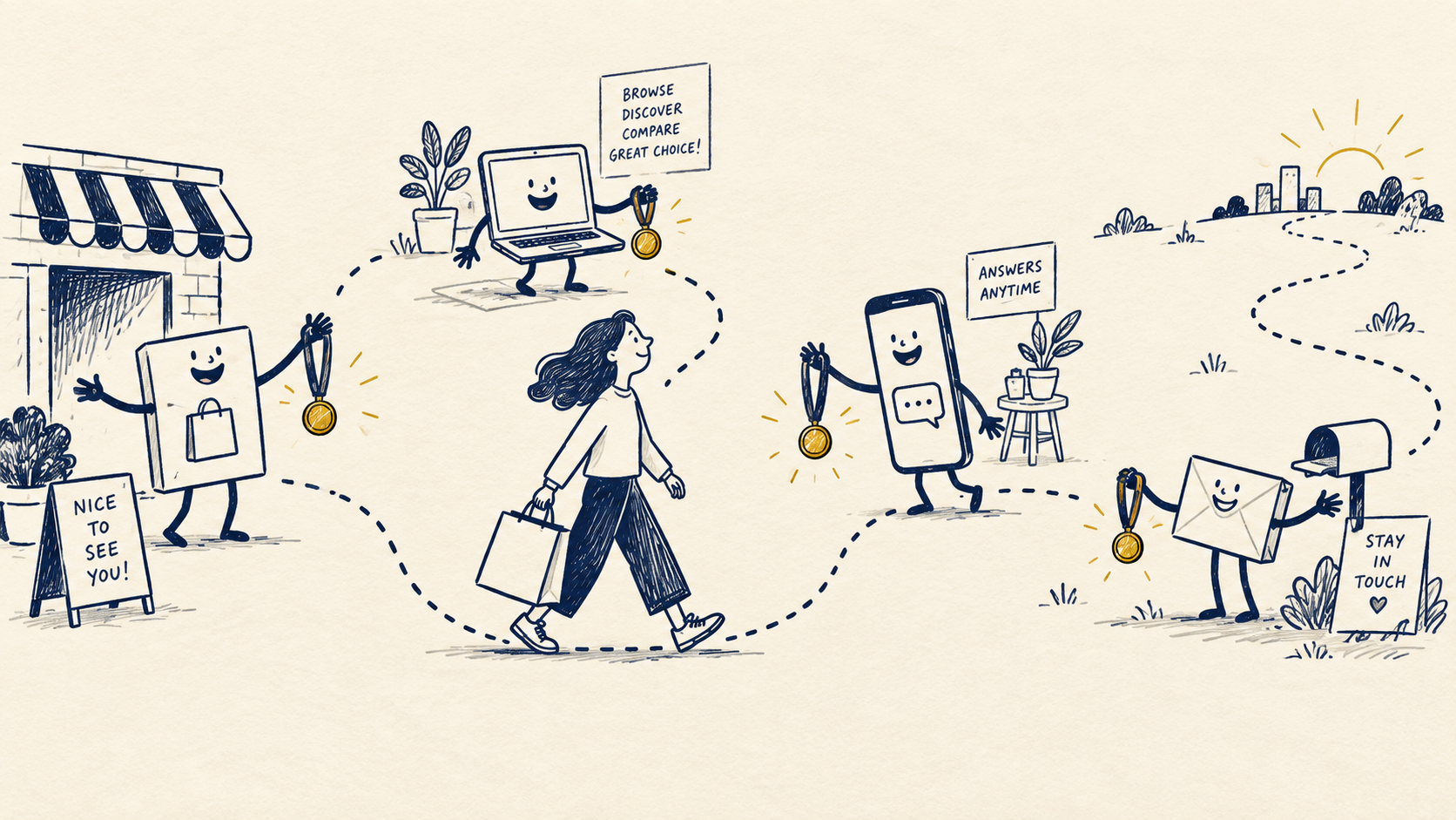
The paid advertisement already had a direct destination, so its visitors had been missing this mess. That created another trap: a good campaign result made it easy to assume the site journey was fine everywhere.
Search traffic arriving elsewhere, returning visitors and people using the home page had a different experience.
When I compare those routes now, I try to follow the actual entry point. “The website works” is far too generous a conclusion from testing one carefully chosen path.
Also, before someone suggests a new search box, fix the label. A search box can be useful. It shouldn't be the emergency exit from a menu nobody understands.
I like nice websites. I especially like nice websites that let me find the service before my tea goes cold.

A thought worth keeping?